St. John the Baptist Catholic Church & St. Elizabeth Ann Seton Catholic School Rebrands
Church, school, and sports team rebranding
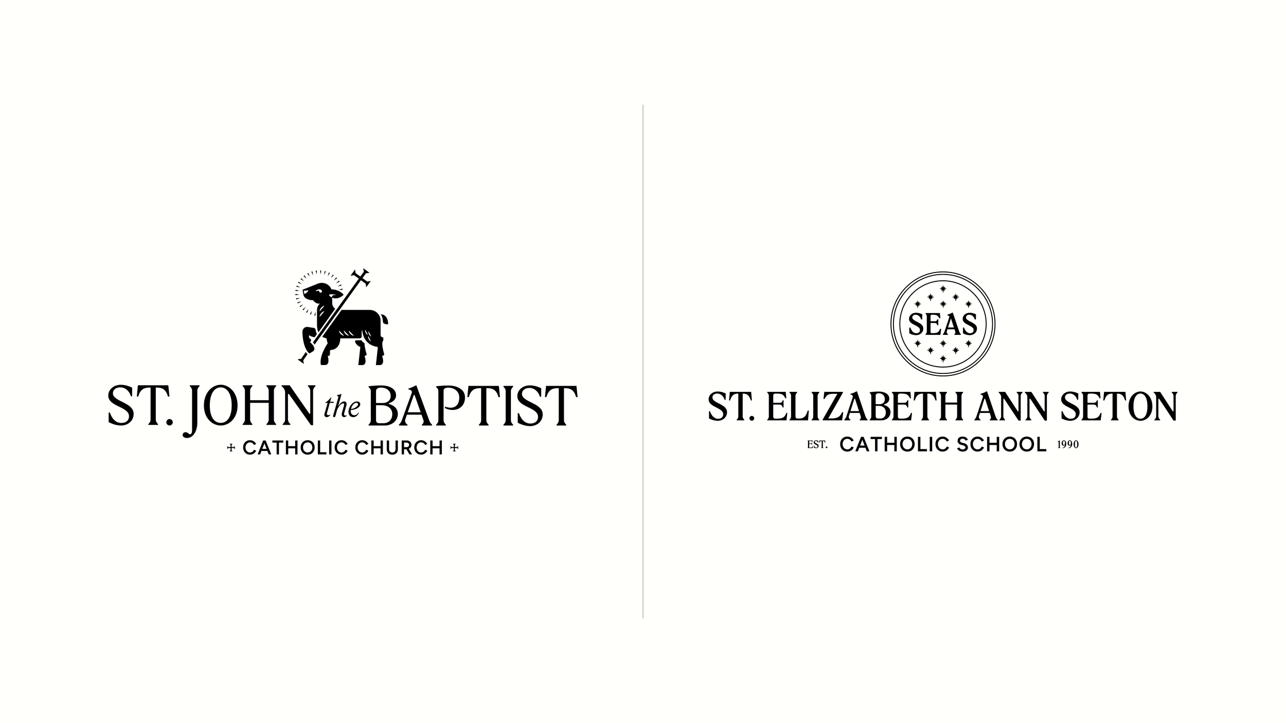
St. John the Baptist Catholic Church has long been one of the largest and most active Catholic communities in Oklahoma, with more than 5,000 parishioners and a growing school at its center. It’s a place that’s expanded steadily over time because people stay. They feel welcomed, they feel known, and they become part of it. That experience carries across everything, from Mass and school to the everyday moments in between. The request to develop their branding wasn’t about creating something new. It was about bringing the identity back into alignment with who they already were.
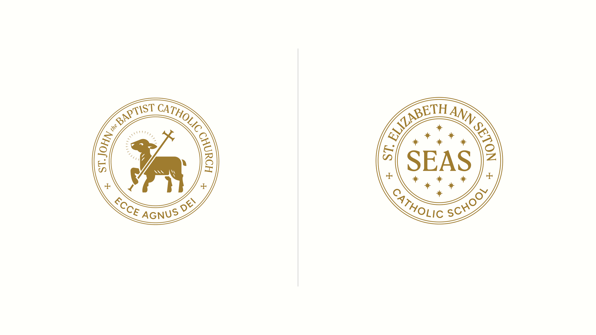
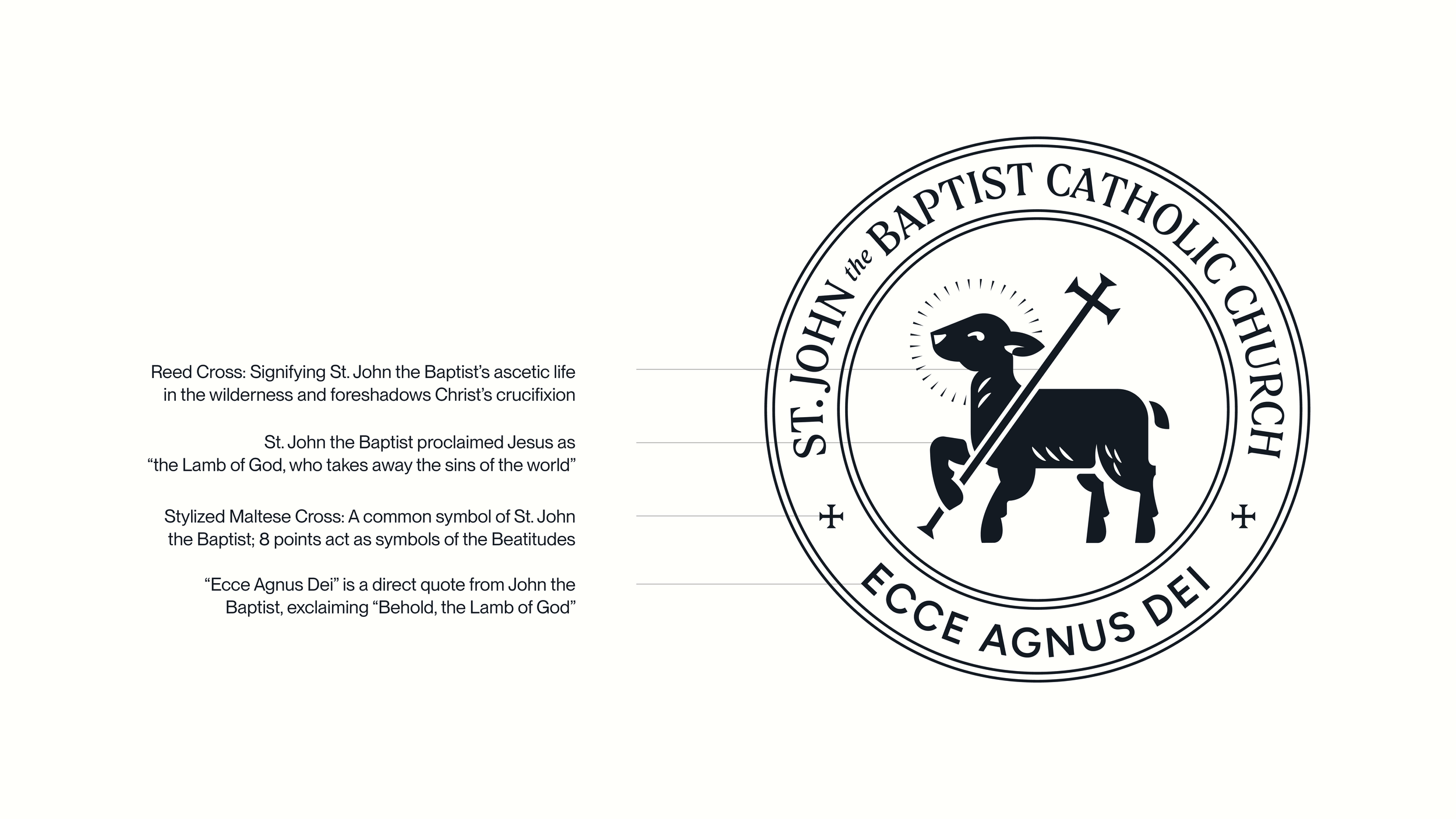
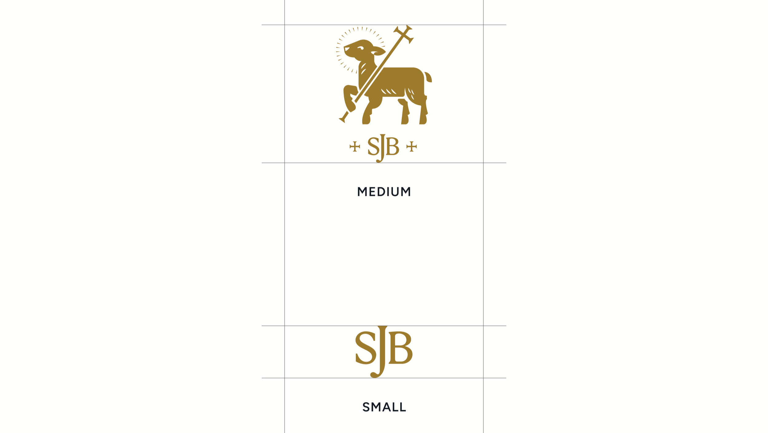
The process centered on clarity, meaning, and cohesion. Early direction focused on building one unified system across the church and school, creating two distinct identities that were clearly part of the same family. Shared structure and a consistent visual language provide cohesion, while differentiation comes through color and saint-specific symbolism.
Clients: St. John the Baptist / SEAS
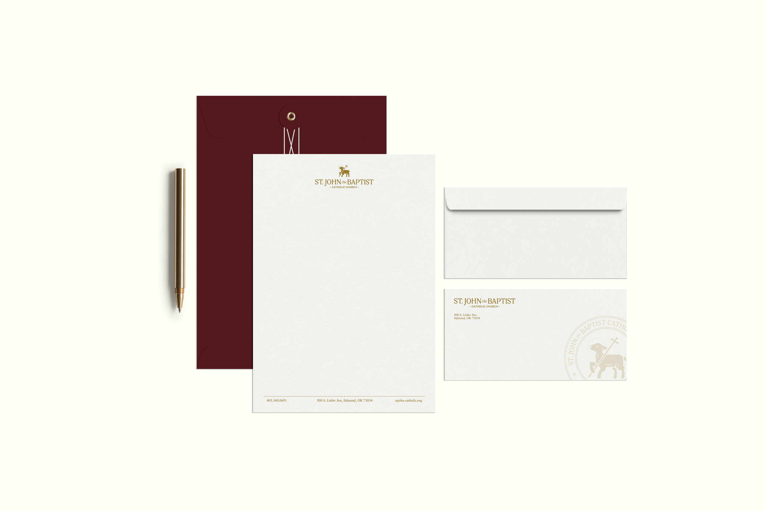

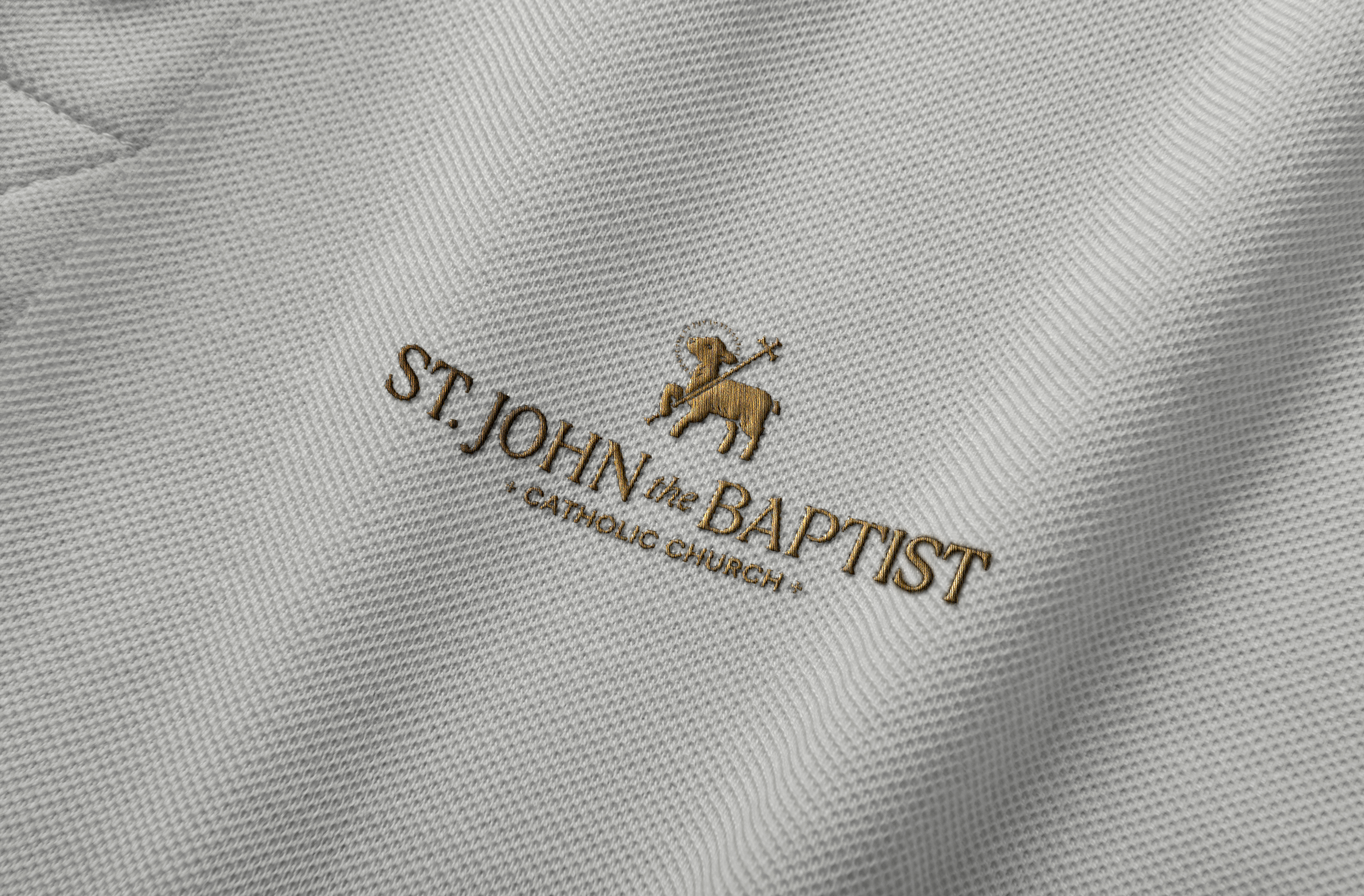
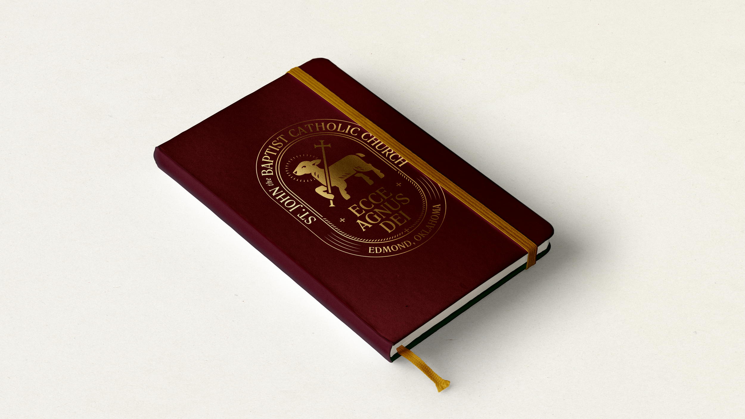
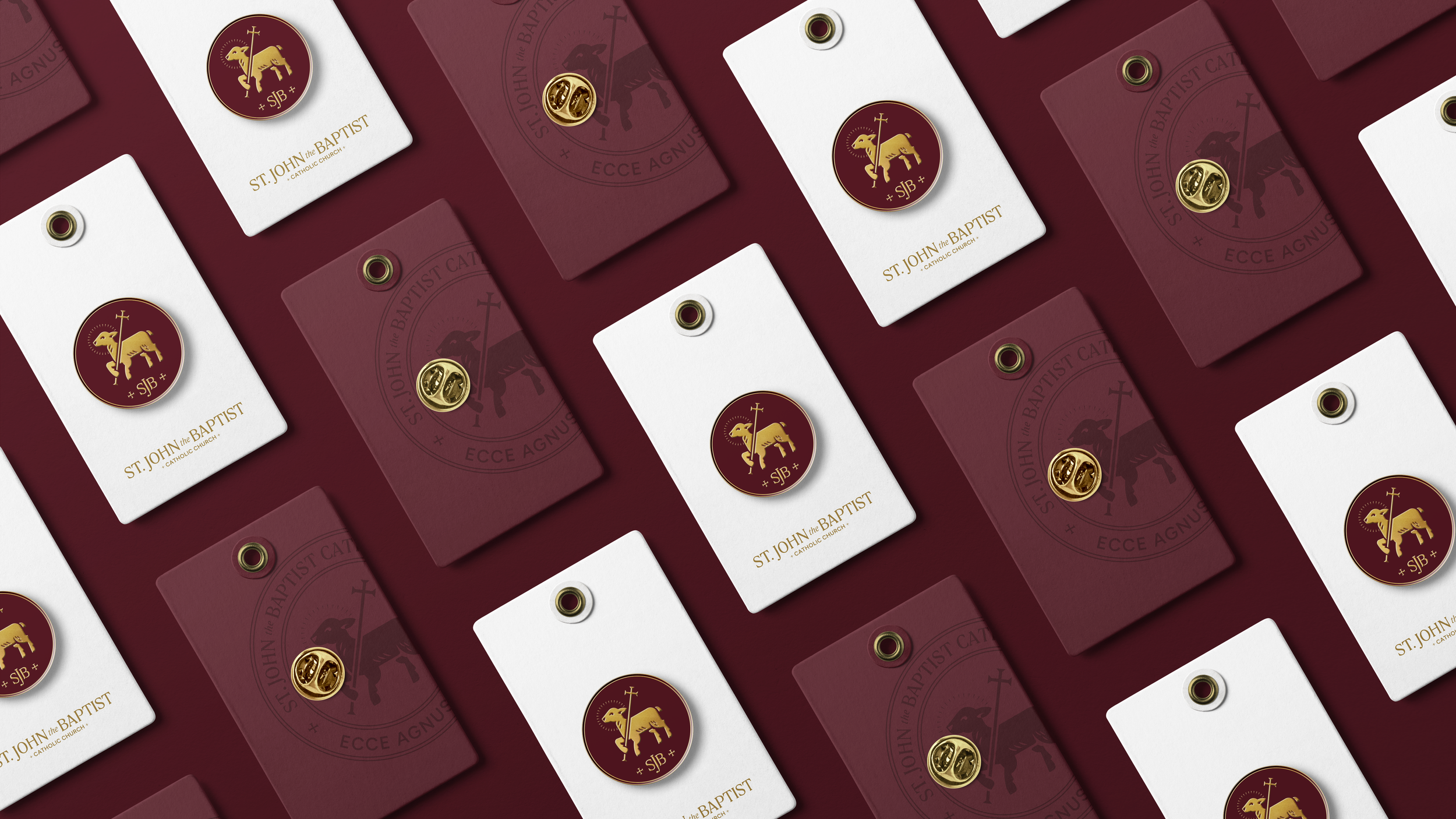
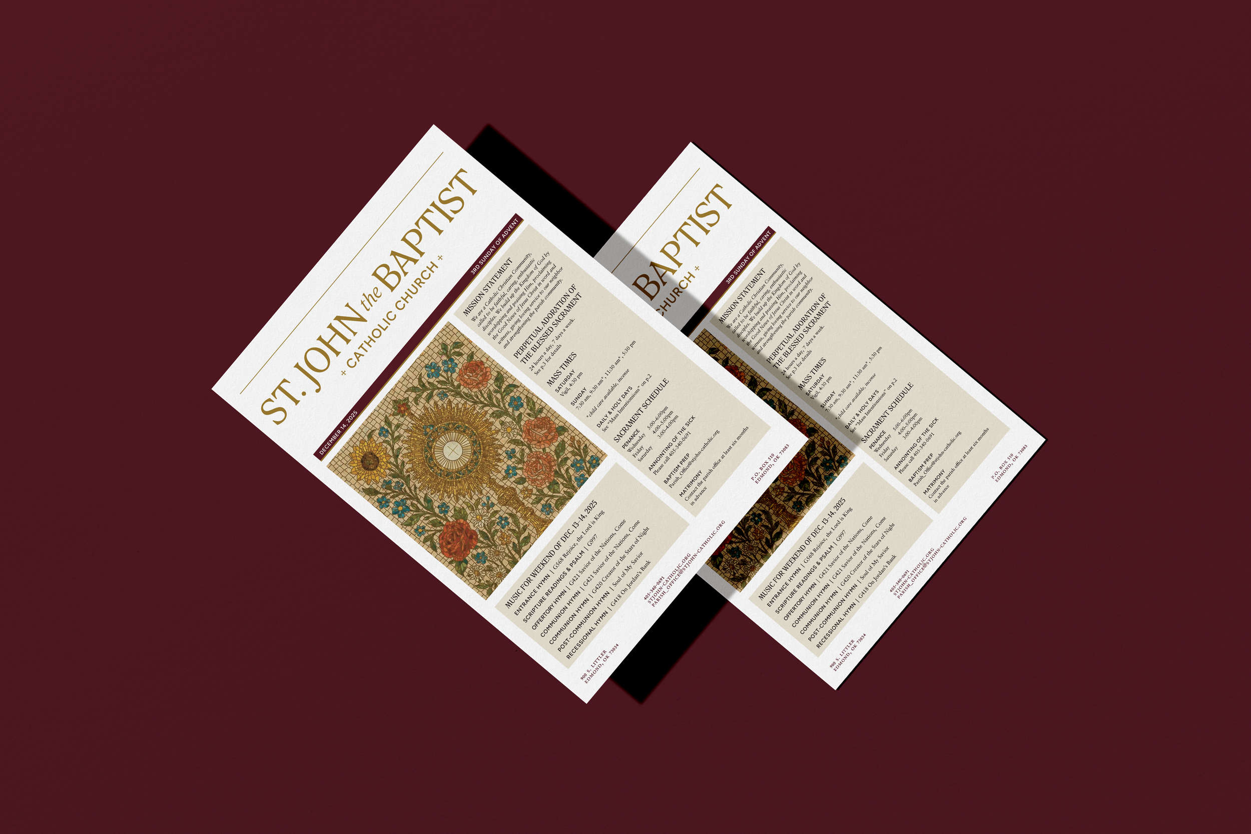
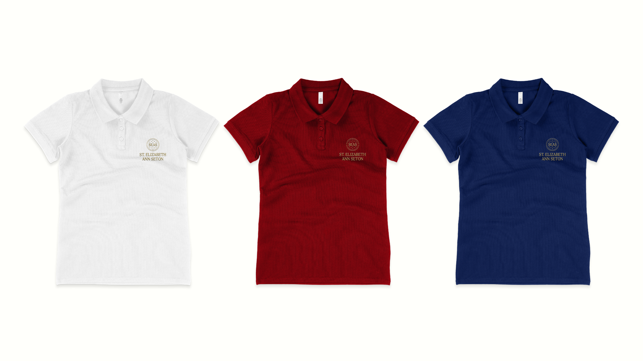
Alongside the church, a companion identity was developed for St. Elizabeth Ann Seton Catholic School. Built from the same framework, it incorporates its own references to education and Marian devotion while remaining visually connected to the parish. The result is a cohesive brand system that reflects the community’s scale, clarity, and character.
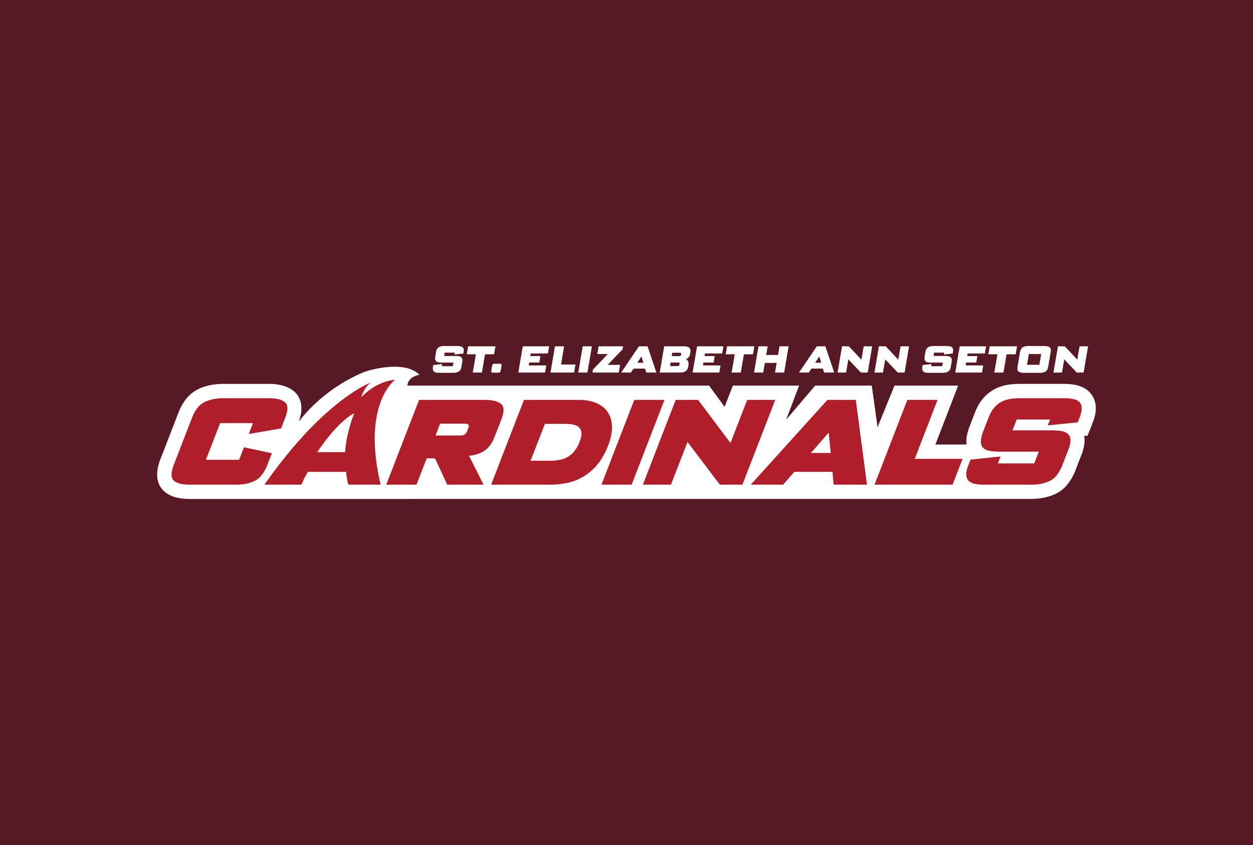
In conjunction with the school brand, we were also asked to take a look at their cardinal sports team branding and give it a facelift as well. They had never had a truly unique Cardinal mascot brand image, so I was tasked with illustrating a fun but intimidating cardinal that would work for a K–8 school.