New in Norman
Supporting a new generation of local artists
When my friends came to me with the idea of starting an annual exhibition to show off rising artists, I immediately fell in love with the mission. New in Norman aims to be a jumping off point for young artists, specifically as a stepping stone so they can put an initial exhibition on their résumés. Exhibitions can be highly selective and will often turn away talent, solely because they have no prior exhibition experience. The brand I developed for New in Norman aims to be visually interesting while still sophisticated, colorful yet subtle, and inclusive of all personalities and artistic mediums.
This project is currently in progress
Branding & Identity
Advertising
Illustrator
Photoshop
RESOURCES & STRATEGYMy Strategy:
Norman, OK is known for two things: The University of Oklahoma and Norman Music Festival. Something that I’ve always admired NMF for is their branding– it’s beautiful every year. A mix of modern design and retro appeal, NMF stands out while accurately capturing the spirit of the music. I wanted to do the same with New in Norman; channel the NMF retro appeal while respecting the sophistication of a proper visual arts exhibition.
My Process:
For such a fun project, it seemed only right to create a semi-custom font for the occasion. I started with a foundation of Acumin Variable Concept UltraBlack and edited the typeface from there. The italic font is Times New Roman, as a nod to New in Norman being a starting point. Who among us didn’t start their schooling experience with Times New Roman?
The Details:
When I think of “new”, I think of clean, fresh, shiny, and sparkly. I wanted to incorporate a touch of sparkle into this brand to convey the newness and the magic of a first exhibition. It’s exciting to see your work in a gallery for the first time, so I wanted to capture that essence in the brand. Likewise, it was important to me that the logo be timeless and multi-functional. The CMYK color scheme is simple and recognizable; however, it’s not owned by any one art form or medium, making it an excellent option for an exhibition featuring all sorts of artists from all backgrounds and mediums. As an annual gallery, including the year in the logo itself seemed crucial for making the mark adaptable for marketing materials, merch, and building hype.
The Final Brand – So Far :
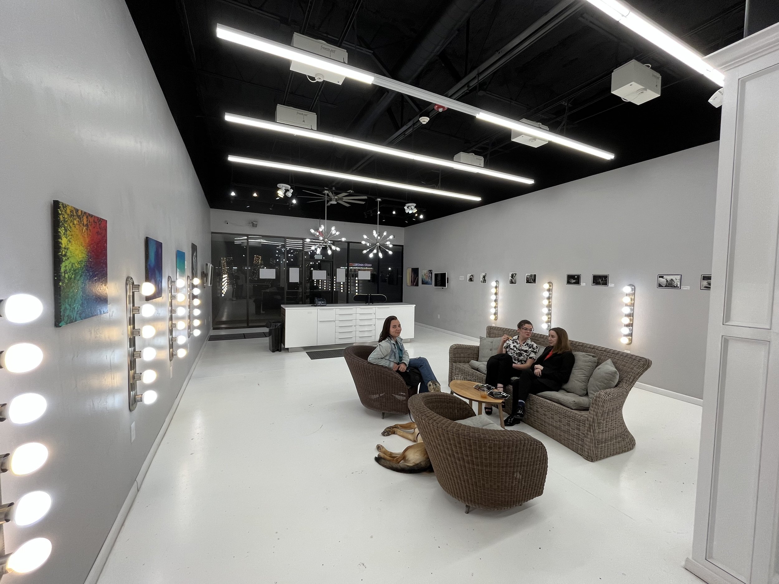
The New in Norman brand is only starting out– its first showing was only a few weeks ago! But we’ve hit the ground running with advertising materials for social media, print, and all identity touchpoints covered. Up next will be animation, website design, and getting social media sites established. The first showing was a hit and I’m so excited to watch this event grow over the years!


