Facets
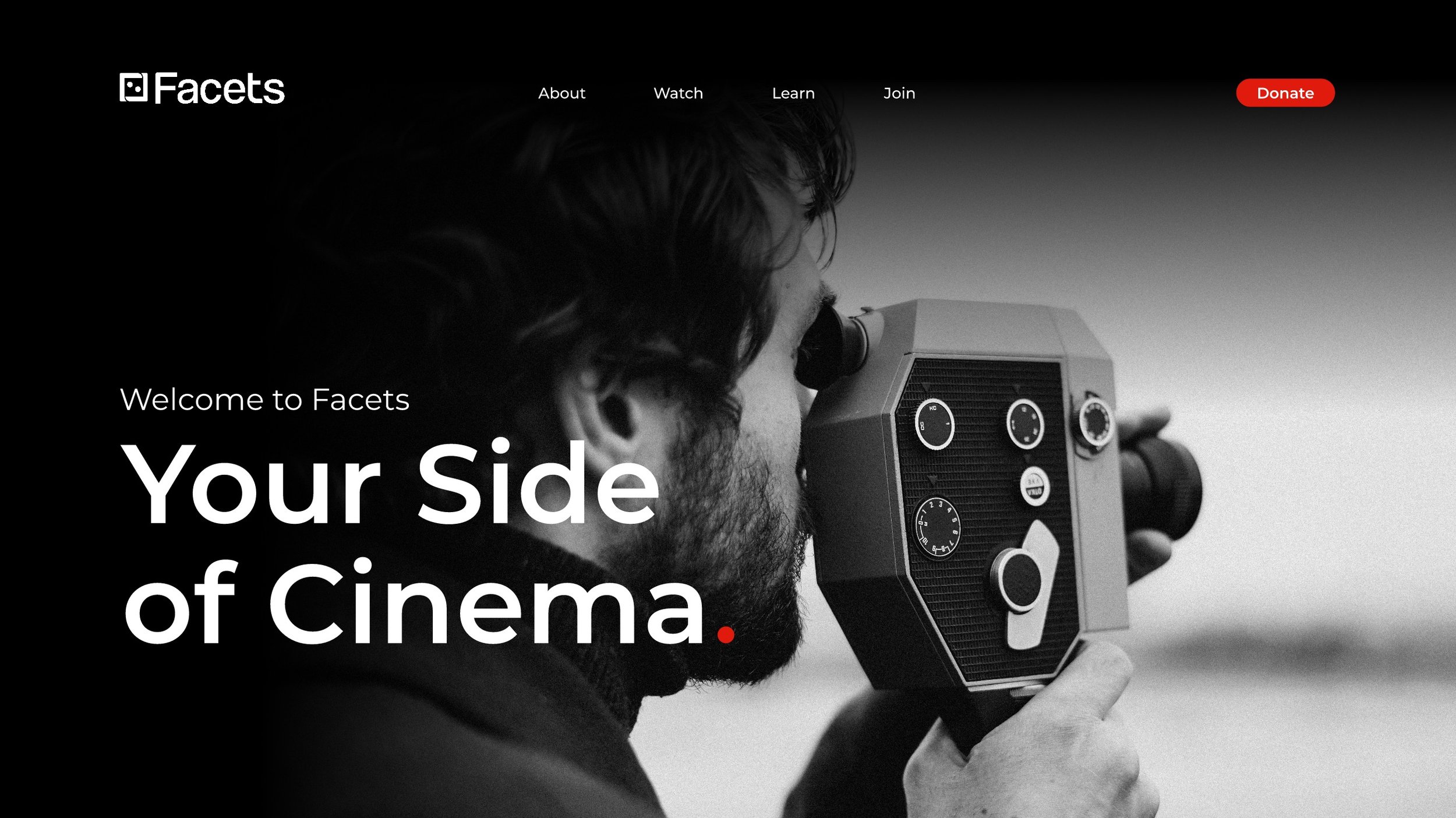
Your Side of Cinema
Facets was founded in 1975 by Milos Stehlik to be a place where people could learn, appreciate, and discuss great cinema. Since then, it has blossomed into a non-profit that provides film and media education, a theatre for viewers to gather, and one of the most successful children's film festivals in the world, the Chicago International Children's Film Festival.
Facets was seeking a brand refresh, as it had not been touched in decades. In order to make Facets stand out from the crowd, my team found it important to explore new icon possibilities, rework the wordmark, bring the color palette into the 21st century while retaining their retro appeal, and create a stunning website that would capture the interest of every demographic. Theatre is for everyone, so the Facets brand should reflect this principal.
Application Design
UI/UX Research
Interaction Design
Graphic Design
Branding
Figma
Illustrator
RESOURCES & STRATEGY
The Problem:
Facets came to us with a problem to solve; their only demographics were children and senior citizens. They had little to no engagement with the demographics between the ages of 18–50. This issue, they suspected, was due to their outdated brand face, inaccessible and dated website, and lack of strategic marketing. My team examined their old brand and strategized new and interesting ways in which they could appeal to their new target demographic by revamping and reinvigorating their public image. Step one, as always, was research. How does Facets stand out in their market? How have other small theatres been successful? Why don’t they appeal to middle demographics and what can we do to accomplish this goal?

When we began this project, Facets had not one, not two, but six different logos floating around the internet.

In order to properly diagnose Facets’ needs, we created clear data visualization where they could see how they stack up to their competitors in different aspects.
Our Process:
An important detail for Facets during their branding transformation is that they wouldn’t lose the essence of who they were. They wanted people to know that they’re a theatre company from the get-go, that they have deeply established roots, and they wanted to be recognizable against the pack. We took these wishes into account throughout the process, deliberately making every move appeal to this ask. Following research, we found inspiration to help align our ideas with what the client requested along with choosing colors and fonts and brainstorming new and improved taglines that could further help them clarify their mission.


Sketching:
The logo went through many, many iterations. We knew we wanted to include a nod to film directors, as Facets hosts a children’s film festival that celebrates young directors. We also wanted to capture the aperture look to reflect a video camera while also keeping it simple enough that it could be made into a snappy animation. Below are some of our early attempts. Likewise, we combed through their existing website to start plotting out the user flows and how it’s built out currently, branch by branch, to visually supply the client with a way to see their website from a birds’ eye view and show them the work that needs to be done.


Assets :
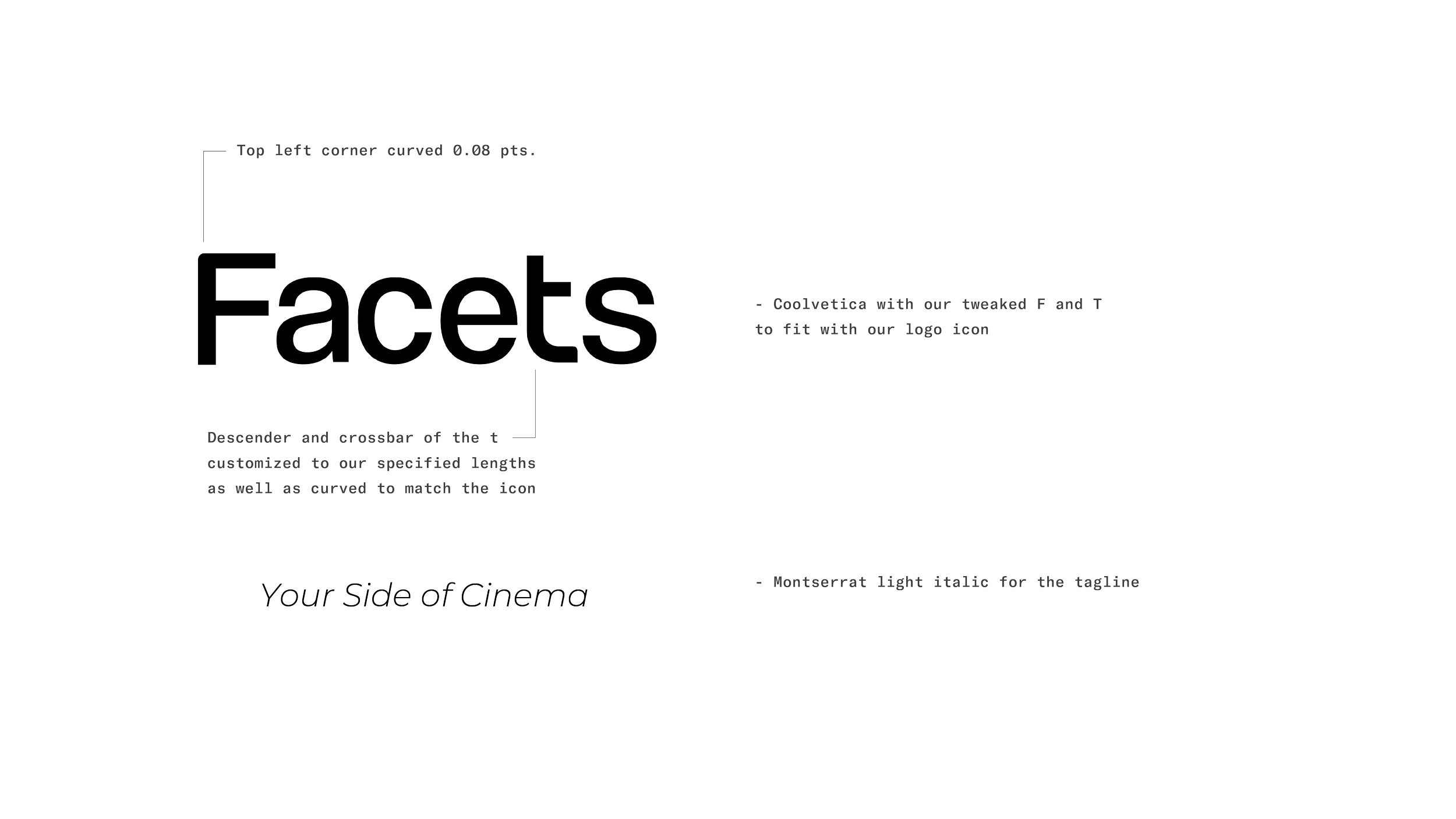
Providing Facets with a timeless brand that could grow and change with them for decades to come was extremely important to us. Choosing a classic but different font as a jumping-off point was crucial– this was how we found Coolvetica. A fun twist on the classic Helvetica, this font has an extra touch of flare. Choosing simple but meaningful colors was equally as important, leading us to a gold to echo awards won, red to represent the red carpet, curtains at a theatre, and the red dot to represent recording.

The Proposed Brand :
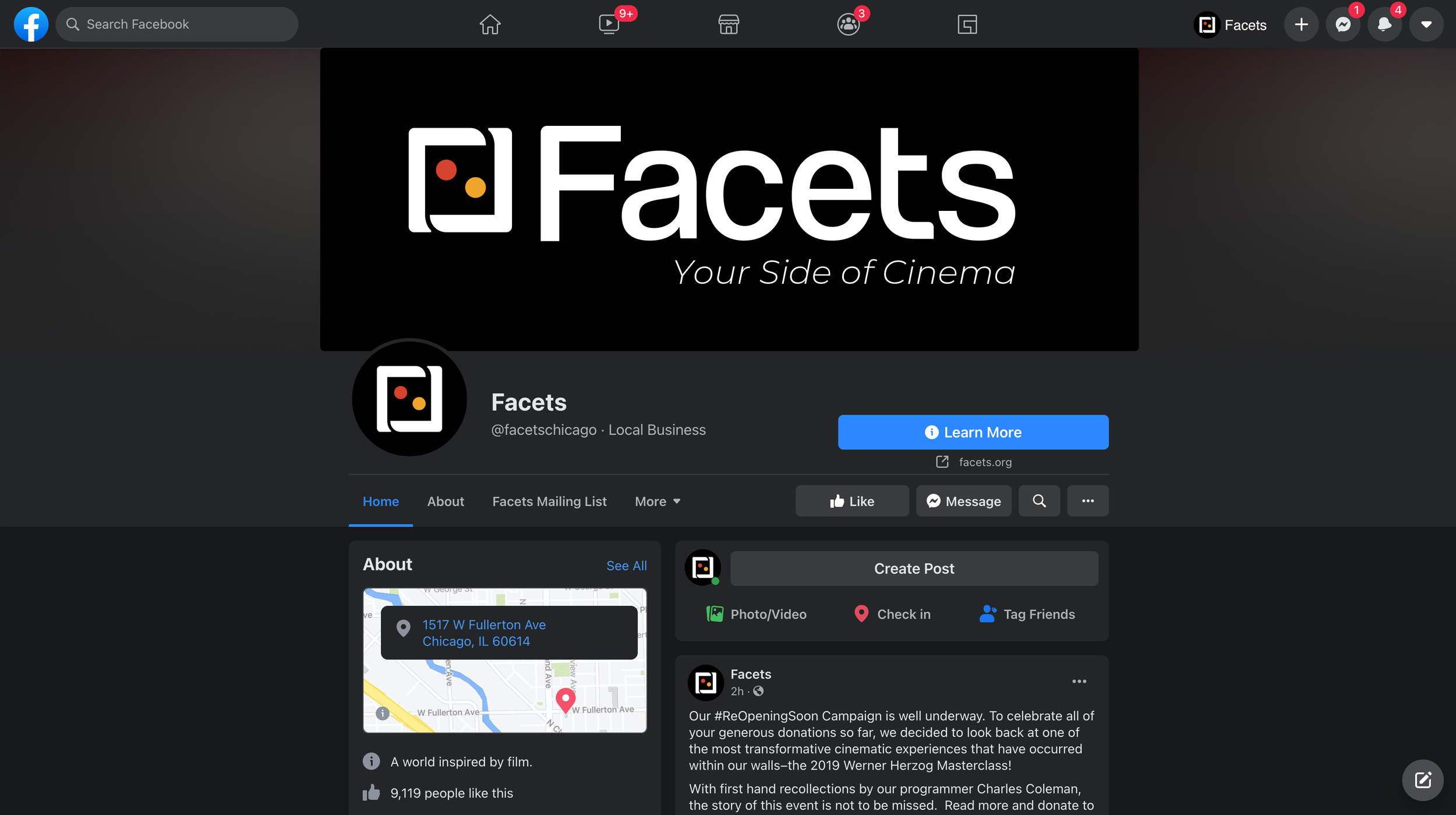
The new brand eventually came together, featuring a new icon, wordmark, typeface, color palette, tagline, website, and animation. The icon retains the idea of director's hands framing a scene with curved corners, representative of how apertures interact in a camera. The two dots in the center represent the “Recording” indicator with the gold representing awards and the “Golden Standard”. The tagline we proposed was “Your Side of Cinema”, drawing from the definition of the word "facet" being "one side of something many-sided, especially of a cut gem”. Therefore, the tagline "Your side of cinema" refers to the multi-faceted nature of Facets. There is something for everyone, and this proposed tagline emphasizes the personal connection the audience can make to the content available from Facets.